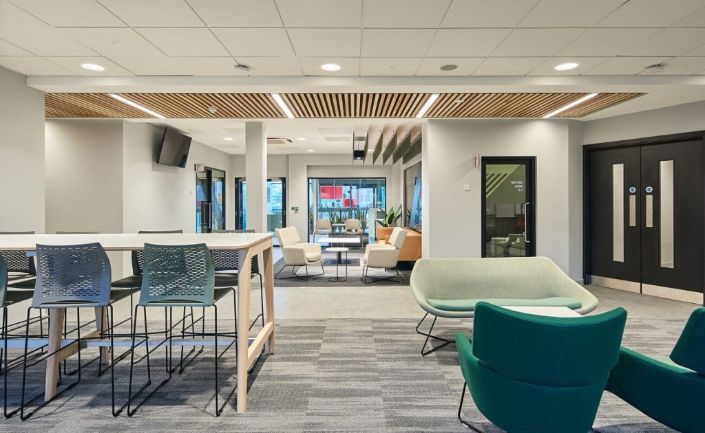
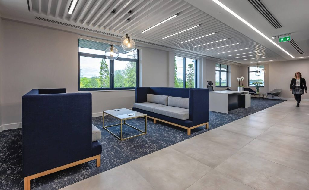
Imagine walking into a sleek, modern office. There are strategically placed skylights for enhanced lighting, this helps highlight the exposed beams that in turn, echo the clean lines of the furniture. The cool tonal palette reflects the brand’s focus on innovation and efficiency.
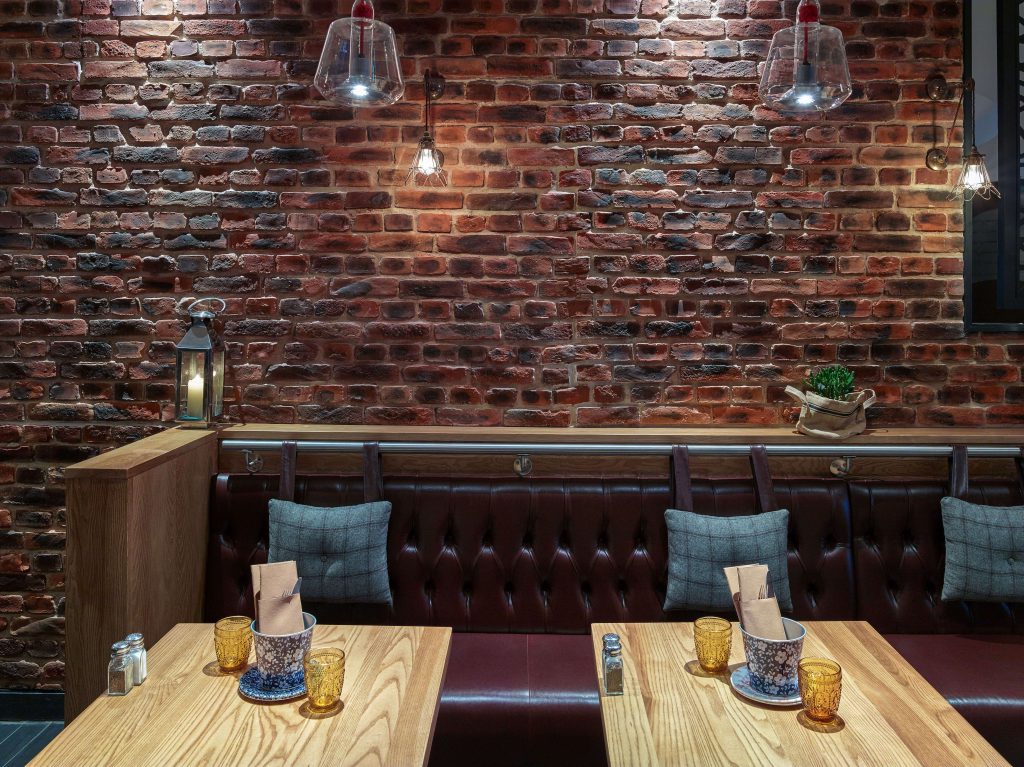
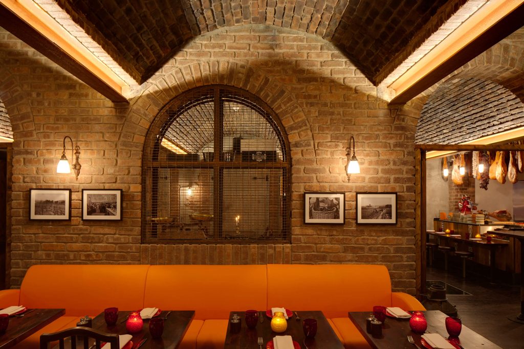
Now contrast this with a hip coffee shop. Warm lighting spills from hanging lamps, casting playful shadows on exposed brick walls adorned with local community artwork. The inviting atmosphere speaks volumes about the brand’s commitment to the neighbourhood and its people.


Ceilings and walls aren’t blank canvases; they’re billboards establishing your clients’ brand identity. The strategic use of these design elements can evoke powerful emotions and create a lasting impression that lingers long after a user walks out the door.
We can also look at a brand as the symphony. The logo is the melody, the colour scheme the harmony, and the furniture the rhythm section. But what about the acoustics? A cluttered, echoing space muddles the message, while a well-managed sound environment allows the brand’s voice to resonate clearly. Whether it’s the warmth of chatter in a restaurant or the soft hum of machines whizzing, these carefully curated soundscapes enhance the brand experience.


Look up, look around, and unleash the potential of your walls and ceilings. Slatted walls can add a touch of warmth to a retail outlet, while high-reaching ceilings with geometric beams can create a sense of awe in a tech company’s headquarters.